July 30, 2009

Oh, the nerves...


My sources tell me that the August issue of Louisville Magazine is on newsstands, and another one of my pieces graces the pages of this finely designed periodical.

This time around, we reverted to my "traditional" illustration style (the last assignment was my "sketchbook" style). The story is rather confusing, but I'll do my best to sum it up. Basically, a neurosurgeon's clinic who did surgeries for one hospital (UofL) signed up to do surgeries for another hospital (Norton) without telling UofL. UofL was forced to fire the clinic, and chaos ensued. It boiled down to money and contracts, trying to work for two separate hospitals, etc. The thumnail process for this was longer than usual as the editor, and the art director, and I struggled to find a strong solution that made sense. Some of my thumbnails are below.


We settled on the final thumbnail because it was a straight solution for a multi-layered story. I then proceeded with a final sketch and a quick color study so Kelly could begin choosing colors for the story layout.


For this piece my technique was a combination of a gouache wash, prismacolors, turpentine (used to melt the prismacolor and paint with the waxy pigment), and the bright light coming from the surgical lamps was created using washes of white acrylic with my favorite medium, GAC 100. Here's a closeup of the piece so you can see the texture.


Overall, I'm pleased with the piece, and so is the magazine (which is most important!). I would love to hear what you think, too!

Cheers,

Cat

July 29, 2009

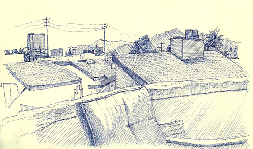
View from Lindsay's


View from Lindsay's, originally uploaded by Gato81.

I spent a recent Saturday afternoon soaking up the sun on my friend's rooftop patio in Westwood. I probably should have used my new set of pens which vary in weight, but instead did this whole thing with a .3mm Hi-Tec C instead. My meticulous nature strikes again!

It also would have been cool to do some washes over it, but I never bring my paints around with me. It seems cumbersome to lug that stuff around all the time, and busting out a travel paint set, brushes, and a water jar while my friends flip through magazines and nap seems strange to me. I guess it just takes getting used to. Any suggestions out there as to how I could ease into sketching with color/paint?

Till next time...

-cat

July 28, 2009

Tuesday Coolsday


Apparently, I typed up my Tuesday Coolsday from last week but forgot to post it before I headed for vacation. I'm sure you have all been suffering terribly from Gato Blog deprivation. Here's a snapshot from me in front of El Capitan and the rest of Yosemite Valley on Saturday morning. And now on back to our regularly scheduled blogging:

Cool finds from working the google reader on the internet machine.

Cool article: Designs on Policy
An article by Allison Arieff on how graphic design plays an important role in everything and should be considered at the national level. Graphic Design isn't just about crazy angles and text and doing something groundbreaking; it affects everything from voting ballots to displaying financials in a pitch. Information needs to be organized in a clear and logical fashion for the end user to understand what is being presented to them. Stop reading this and go read the article. via NY Times

Cool watercolorist: Nina Johansson
This chic does lovely little plein air paintings that knock my socks off. Just look at the texture in this piece, and she's even so kind as to show us her process. My watercolors are at a zygote level so I appreciate seeing how other artists work. via... don't remember!

Cool mock beer cans: All in the Familjen

The cute, naive, monotone illustrations make these beer cans really pop off the shelf... Well, if they ever made it to a shelf. I know I would buy them simply based on their packaging. Hear that, all you VP's of Marketing??? via Twig & Thistle

Till next time, thanks for reading!

July 18, 2009

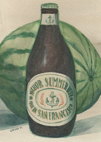
Anchor Summer Beer

Anchor Summer - 5" x 7" - Watercolor on Canson Cold Press Watercolor Paper

For Sale: $75, price includes shipping cost

Another new beer on the beer blog... And testing this "blogging through flickr" thing.

July 16, 2009

Hold me closer, tiny palm trees


Feeling unmotivated this week. Last night I tackled something small... 3"x3" to be exact.

Tools: gessoed canvas glued to illustration board. Prismacolors. Turpentine. Photo taken at LACMA.

I cut this board back in 2006 while at the Illustration Academy. It was originally intended for tiny oil painting portraits, like the one below of Jennifer Coolidge.

The texture doesn't work well here; my usual gessoed illustration board would be better for this experimental style. I'll leave the canvas for thicker applications of paint.

And here's Ms. Coolidge. It's been a while since I have done a caricature/portrait. Who should I do next?

July 13, 2009

Tuesday Coolsday

Cool finds from working the google reader on the internet machine. This is a special entry dedicated to children's books, an industry in which I'm interested in getting involved.

Cool children's book from my childhood:
Cloudy with a Chance of Meatballs

"If food dropped like rain from the sky, wouldn't it be marvelous! Or would it? It could, after all, be messy. And you'd have no choice. What if you didn't like what fell? Or what if too much came? Have you ever thought of what it might be like to be squashed flat by a pancake?"
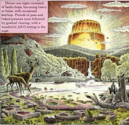
This book by illustrator Ron Barrett and his wife, Judi, is a favorite and inspired me to become an artist as a child. What I think makes this book successful are the details and "easter eggs" found in the illustrations. You can read the story again and again and find new puns. For example, when I reread it recently, I noticed a moving truck on the street with the company name "Bowel Movers." A 4 year old won't get that, but their parents will! I'm especially excited that Sony is making a 3D movie based on the story coming out in September.

Cool children's book by a hero:
The Remarkable Farkle McBride

Written by actor John Lithgow and illustrated by one of my favorites, C.F. Payne, this book has a great sing-song rhythm to it. I think it would really appeal to children interested in music, or maybe inspire them to learn an instrument. Once again, this book has lots of interesting stuff scattered about the page to keep a child engaged.

Cool buddy who illustrates children's books:
Britt Spencer

Fellow Kentuckian turned Angelino does really great illustrations based on solid drawing, which is a relief to me after seeing all the "naive" artwork that my left-brained, untrained, can't-draw-a-stick-figure boyfriend is probably capable of. I digress. Britt recently had a book signing at Every Picture Tells a Story, a cool children's book store/gallery in Santa Monica. I had the pleasure of seeing his originals from his latest book, Zarafa. You should definitely take the time to peruse his site and check out his News page where he shares some amusing insights to his work and experiences.

Till next time, cheers!

Map for Maribeth's Wedding


Ah, the end of a very long, busy, and exhausting week, and the beginning of another! I finished another assignment for Louisville Magazine last night. It will be out in the August issue so I'll be sure to share it when it's published.

In the meantime, here's a project I did for a friend at work. She needed a map to go with her wedding stationery. I drew the map with pencil and laid out the text for a predetermined size & template (the star & the dots are a theme on her stuff, and I used the same fonts she had chosen for her invitation).

I think it turned out really cute. It's such a cool, personalized way to include a map with the wedding invitation. If anyone out there needs one done, contact me for a quote!

July 9, 2009

Delicious Apple


This is a doodle - I think. Does it count as a doodle if I set out to doodle it intentionally? It started as a drawing of an apple while on a mind numbing conference call at work, then words and shapes were added, and then I cross hatched while sitting in front of the boob tube. It's a departure from my usual drawn-from-life stuff, probably inspired by all the great psychadelic illustrations that I'm seeing around the web. I'll probably paint this eventually, but right now I have 7,489,698 projects going on. It will have to wait.

Speaking of projects, back to work!

...Does it count as work if I enjoy it?

July 7, 2009

Tuesday Coolsday

Cool finds from working the google reader on the internet machine.

Cool package design: Deschutes Beer Bond Street Series I like to drink beer, I like to paint beer, and I like beer packaging. Naturally I was attracted to this beer packaging that uses illustrations by Adam Haynes for the labels. Maybe I should add a beer label design/illustration to my never-ending list of projects? via Lovely Package


Cool environmental design: Dupont Circle Street Banners
The monotone, bright, graphic illustrations work well alone, but also look outstanding in the banner design and as a unit. The architecture one is my favorite. via the website of the designer behind Death by Kerning


Cool skateboard design: Zoo York
If I were into skating, I would want one of these decks. I love the colors, shapes, patterns, handwritten text.... ahhh. It's official; I have another artist crush. via Oh Joy!


Cool designer buddy: Five Dot Design (links to Etsy shop)
Kristen who heads up the shop Five Dot Design was a fellow art major at University of Dayton. In addition to her full time design job, she's been developing lines of stationery and other goodies. Her stuff is really delicate and carefully designed with close attention to typographic details. According to her blog, she's gearing up to go full force into wedding stationery, and I bet it will be outstanding!

July 3, 2009

Dysfunction Junction


I created this illustration recently for Louisville Magazine, and it's finally out on newsstands! The art director requested I use my "sketchbook style" which she discovered via my newly redesigned website, www.catscott.com. I'm really glad she suggested it - I thought the grittiness and messiness of the line work really worked well with the story, which was about Louisville's Spaghetti Junction and what a mess it has become. They're currently thinking about upping the concrete to 24 lanes - how completely ludicrous is that? By 2080 Louisville will become a tangled mess of freeways. I tend to side with the grassroots movement 8664 which seeks to replace the highways with tree lined boulevards and parks. We'll see what happens!

Here's the spread in the magazine with the art director's typesetting over my illo. It was kind of hard to leave space when you don't really know what's going to happen there. Now that I see the final, I think I should have done a wash over the "reserved space" but I didn't know how that would interfere with her typography.


Detail of the drawing. I used a Hi-Tec C blue pen and then did washes over the drawing with Acrylic mixed with Gac 100.


I just got another assignment from the folks at LouMag, for which I am always thankful.

Thanks for reading, and have a happy and safe 4th of July!