August 31, 2009

Teaser


I spent all weekend working on the final for my latest illustration assignment (small preview above):
  • Friday night while watching movies.

  • Saturday afternoon next to the pool.

  • Saturday night while Jason and Dana played "Call to Duty."

  • Sunday afternoon while trying not to melt in our apartment.

  • Finishing it up (and blogging about it) while Jason sleeps soundly next to me.

I really need a new technique that isn't so damn time consuming.

August 28, 2009

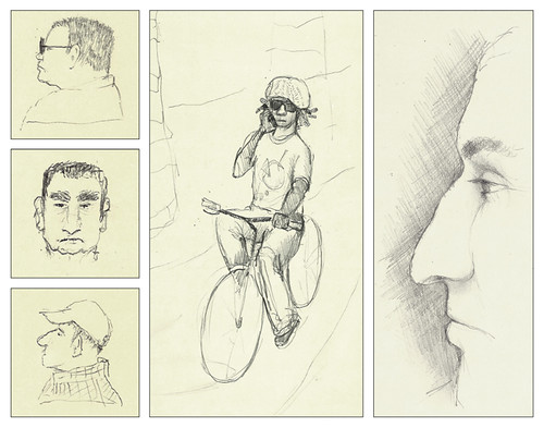
Characters


Characters, originally uploaded by Gato81.

I have been trying something new: drawing people from memory after spotting them while out and about. Things have started roughly, but I think it will be good exercise.

I've also been using pencil a bit more. It's such a great, versatile medium, why should I limit myself to pen drawings? Oh yeah - so I don't fuss with the drawing, and learn to be accurate with the line I put down. But I think it's okay to mix it up.

Currently working on an assignment for an RV lifestyle magazine. It's a fun assignment - I'll post it as soon as the mag is published!

Have a great weekend!

August 25, 2009

Tuesday Coolsday

Cool finds from working the google reader on the internet machine.

Animation has never blown my skirt up until now.

Cool Low-Frills Stopmotion Animation: Firekite's Autumn Story video
Mesmerizing. Beautiful. And it's just chalkboards! By Lucinda Schreiber and Yanni Kronenberg.


Cool Higher Frills Stopmotion Animation: Coldplay's Strawberry Swing Video
I have no words. Please just watch. By Shynola.

Both amazing animations found via Drawn! Thanks for reading, 'till next Tuesday!

August 24, 2009

My desk at ES


My desk at ES, originally uploaded by Gato81.

The summer months tend to be slow at my company, a commercial real estate investment banking firm, where I work as a graphic designer. I don't usually draw anything around my desk because it's all so dull and I stare at it every day, but doing this whole "landscape" was kind of fun. It's kind of a mess, but it's very me.

Highlights from this landscape:

  • my giant monitor (the scale here is all screwed up, trust me, it's huge)

  • the fact that my giant monitor sits on a ream of paper. Fancy monitor stands are just a little too high.

  • stack of business cards: I have given out 1, and it was to the shoe-cobbler who comes around our office.

  • white castle mug that sits on a donut coffee-warmer

  • the fancy phone on which I receive about 2 phone calls a week

  • the fancy halogen light that doesn't even work, but I leave it there anyway

  • the decorative stone container (in front of my phone); handmade in Africa and purchased for me by a Silver Bay buddy. I keep vitamins in it.

  • the mouse hiding behind the phone. I use a wacom tablet so the mouse only gets used by the IT guy when he comes by

I drew this with a uni•ball vision elite in my Strathmore sketch pad, which is considerably less intimidating than my Moleskin. This is probably a good thing, because I couldn't find my favorite thick paper Moleskin at Hennessey & Ingalls today. Sad.

August 21, 2009

Promos!


As all of my faithful readers know, I have done quite a bit of work for Louisville Magazine.  The time has come for me to branch out and market myself to a few other publications to (hopefully) get some work from them, too.  I created a mini brochure that I mailed along with a handwritten letter, and of course, each envelope was hand lettered too!  

If you would like to view the brochure (and print it out and give it to your art director buddy), please download the PDF here:  Cat Scott Promo

Thanks to Katy A for her wonderful photography skills! 

Have a great weekend.

August 19, 2009

Wednesday Coolsday?

A little late on the weekly post. There are excuses but I won't bore you with them.

Cool finds from working the google reader on the internet machine.

Cool Gallery Opening: Sterling Hundley

Sterling was one of my instructors at the Illustration Academy and is a huge inspiration to me (and just about every other illustrator I know).  He has been working diligently towards some personal work for a gallery. If you are going to be in the Richmond Area between September 4 and 26, you absolutely must stop by the Ghostpring Gallery.

See Sterling's Illustration Portfolio here.  But please don't compare it to mine.

Cool Photographer: Megan Resch

I've known Megan since we were about 12 or 13 (I think?), so obviously I'm biased when I say she's incredibly talented.  But the Wedding Photojournalist Association gave her a big shiny award, and I think their opinion is pretty valid.  Plus, her work speaks for herself.  Great composition, contrast, and beautiful saturated colors.  She does mostly weddings, but jumps at the opportunity to do family portraits.  The link above is to her real site, but check out her blog to get a glimpse into her current activity. Lots of great work on there.

Megan just had a little baby - congratulations, Megan!

Thanks for reading, 'till next Tuesday!

August 17, 2009

Total Body Source


A few months ago, I created a logo for an online health products website called Total Body Source. I just saw that it has gone live! I worked with the site designer. He had a really clear vision for the site and gave really great art direction. Isn't his final product top notch? I was happy to incorporate some of my handwritten text in the logo... lends itself nicely to the organic/natural theme.

I just dropped my mom off at LAX after many days of tromping around the city. Back to the grindstone today.

Hope everyone had a great weekend!

August 11, 2009

Tuesday Coolsday


Cool finds from working the google reader on the internet machine.

Cool Hand Lettering: Rudi de Wet

I'm so attracted to hand written text these days, and Rudi de Wet's stuff really jumped out at me from my Google Reader because of his bold use of color. Definitely take some time to see all of his samples.


via Design Work Life

Cool Louisville Painter: Ashley Cecil

Ashley is a fellow Kentuckian and UD grad. She is a social activist that has found a way to use her great talent of painting to raise awareness for many non-profits in Kentuckiana. Her oil paintings and watercolors are vibrant and impressionistic - my kind of style! Be sure to snatch up some of her originals - part of the proceeds go towards a great cause!

Thanks for reading, 'till next Tuesday!

August 10, 2009

Whale sketch


whale sketch, originally uploaded by Gato81.

A friend of a friend is writing a children's book involving a whale and a little girl. I liked the idea and started doodling.

We might work together on her submission to publishers, and even if we don't, I want to use this in another way. It will be a nice beginning to a children-friendly portfolio! She's a cute SheWhale, isn't she?

August 6, 2009

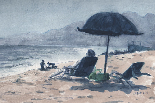
Will Rogers


Will Rogers, originally uploaded by Gato81.

I brought my watercolor pad to the beach on Saturday afternoon to attempt some late afternoon "plein air" sketching and painting. I started with a pen sketch (the usual Hi-Tec C, in Blue) and then added washes of watercolor. I had some issues with the paper repelling the paint over on the left hand side. I guess it's from sunscreen rubbing off of my arm while I did the sketch (I'm left-handed).

When I returned home, I wanted to drop back the value of the mountains. The color I originally used was pretty dark, and if you have ever been to the beach in LA, you know the mountains are hazy and washed out! So I got out the trusty GAC 100 and some Titanium White and painted over the sky & mountains. I felt pretty good about it.

A little while later, I found mysterious water/GAC splotches on the painting. Not detrimental, but still frustrating. Ugh. I guess that's why this is "sketchbook" work :)

August 4, 2009

Tuesday Coolsday

Cool finds from working the google reader on the internet machine.


Cool Daily Painter/Blogger: Karin Jurick
I have been following the blog of a "Daily Painter" named Karin Jurick for quite some time. Her paintings are fairly impressionistic with vibrant color and spontaneous, loose, brushwork. Occasionally she spends more than an hour or two on a painting and produces something really striking like this San Francisco scene. It's incredibly reminiscent of Wayne Thiebaud's San Francisco landscapes....
Cool Famous Painter: Wayne Thiebaud
Nice transition, huh? I've been a huge fan of Wayne Thiebaud ever since I saw his famous colorful paintings of gumballs and cakes, but fell head over heels when I saw his San Francisco landscapes. They are incredibly stylized and some are almost cubist, so I guess Karin's landscape isn't exactly the same, but you can see the similarities, right? The blue/violet shadows in his paintings really blow my skirt up. Mmmm. He doesn't have a web page, so I recommend perusing google images to see his stuff.
Thanks for reading, 'till next Tuesday!