June 13, 2011

The Real Celebrities - Illustration for Alfred Hitchcock Mystery Magazine

illustration for alfred hitchcock mystery magazine, by cat scott

When Alfred Hitchcock Mystery Magazine contacted me to do an illustration for one of their stories, I jumped at the opportunity. Fellow Illustration Academy graduates Edward Kinsella, Andrew Wright, and Jorge Mascarenhas had all done really cool work for the magazine so it made me feel like I was joining the ranks of these uber-talented illustrators.

The story was an entertaining suspense called “The Real Celebrities” about a murder amongst some costumed would-be actors in Hollywood (excerpted here). It’s always fun to draw some famous people...especially Hugh Jackman.

I’m happy to have another example of my “Sketchbook Style” illustration. This style is taking over my illustration portfolio because it is my favorite way to work. The tediousness of the cross-hatching step appeals to the nerdy analytical side of me, and the looseness and impressionism of the paint application step helps keep it fun and spontaneous.

Stay tuned for another illustration I did for them in the August/September issue, and a website update!

Thanks for reading!

-Cat


Cat Scott
Louisville Illustrator and Graphic Designer
www.CatScott.com

March 26, 2011

Derby Etiquette Illustration for Louisville Magazine

derby etiquette illustration for louisville magazine

Louisville Magazine, contacted me to do an illustration for their Derby issue this year, and of COURSE I jumped at the opportunity! It's always such an exciting issue to be a part of. The article is about Derby Etiquette and discusses how NOT to be "that guy" when you are out at Churchill Downs.

Below are the thumbnails I sent the art director:

thumbnail drawings for derby illustration

She chose the bottom right option. Here's the final drawing before I took it to final:

final drawing of derby illustration

And since I know you love seeing some behind-the-scenes action, here's a few of the reference photos we took. Pardon the poor white balancing, these aren't usually for the public's eye, they are just for getting a hand shape correct or a shoulder in place.

Till next time! p.s. Go Knights!

Cat Scott
Louisville Graphic Designer and Illustrator
www.CatScott.com

March 23, 2011

Wedding Website

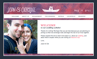
wedding website screenshot

Before the wedding invitations could go out, I had to make sure the wedding website was up and running!

With so many out-of-town guests, and with me being a giant web-nerd, it was important to me to have a website full of information on visiting Louisville. At first I was lulled by the simplicity of building a site on TheKnot.com, but the lack of customization made my skin crawl. So I built us a nice site from scratch using good old fashioned XHTML and CSS:

www.JasonAndCat.com

It's not that fancy, but neither is the wedding, plus it ties in with the invitation design and provides visitors the information they need. And it's not a cheesy template from the Knot. I love that I can keep updating it - like maybe I should add in those flowers from the invitation in the header? Sure, why not. It's a work in progress.

Next on the wedding posts, I'll write about our Save the Date cards which don't totally match anything but were the springboard for some of the elements you see on the website and in the invitation.

Thanks for stopping by!

cat

p.s. I'm learning more and more about web development at my day job, so please don't judge some of my inefficient coding!

p.p.s. Feel free to purchase us gifts from our Honeyfund registry!

Cat Scott
Louisville Graphic Designer and Illustrator
www.CatScott.com

March 16, 2011

Wedding Invitations

Have I mentioned in this space that I'm engaged to My Biggest Fan, Jason? Wedding day is less than two months away. Yet another reason I've been quiet on the blog.

As a creative person, I have set out to tackle a boatload of Do It Yourself Projects to give my wedding that "personal charm," and a perk is that we save a lot of money!

One of my main projects was the invitation. In the wedding blog world, there are scores of elaborate, beautiful invitation suites with wonderful calligraphy, screen-printing, special sourced papers, and of course intricately designed type treatments. However, our wedding is a 50-person daytime garden wedding, so none of that felt right to us. Our ceremony and reception will be personal, simple and sweet, so that's what our invitations needed to convey.

Some details on the creation:

Our "logo" is a little sketch I did of the two of us kissing in a canoe (we got engaged in a canoe in Asheville, NC). The flowers were hand drawn in illustrator and filled with an abstract pink & purple watercolor I painted. The white parts of the invitation and RSVP were printed on my inkjet and trimmed by hand with an x-acto knife (not so bad when you only have 40 invitations). Katy and I then spray-mounted them onto trimmed pieces of a beautiful navy Classic Columns paper. Finishing touch is a pretty pink ribbon. Envelopes are standard cheapo envelopes from Staples with "calligraphy" done by me with a pretty pink/purple marker pen and a standard blue rollerball pen.

Below are some photos of the invitations. The really nice looking ones of the RSVP card and the envelopes are by my uber-talented bridesmaid Katy A who helped me assemble invites while she was in Louisville. The others are by me with my crappy point-and-shoot.


wedding invitation calligraphy
wedding invitation envelopes

Must stop blogging and start DIYing! Thanks for reading.

cat

Cat Scott
Louisville Graphic Designer and Illustrator
www.CatScott.com

February 13, 2011

La Scala Milan Illustration

illustration of la scala milan

Just when one book design was wrapping up, another project began. This time it's for a book about learning to love opera, penned by Louisville author, speaker, and expert on the arts, Thomson Smillie. What is especially exciting about this project is that he wants to sprinkle it with lots of fun illustrations by moi!

For the cover, we went with the striking facade of Teatro alla Scala in Milan.

I love how my new "sketchbook" illustration style (which is the only style I use now) allows me to be more impressionistic. There is no need to get caught up in the details which keeps the illustrations loose and fresh. Thomson said it best; "You don't need to draw every architectural detail of the facade for someone to recognize it as La Scala. Either you recognize it, or you don't!"

This project should be wrapping up by summer time, so hopefully I will have lots of opera-related illustrations to share with you.

Till next time,

cat

Cat Scott
Louisville Graphic Designer and Illustrator
www.CatScott.com

February 2, 2011

illustrations for enGrossed.me


Another thing that has kept me busy for the past several months is a full time gig I started in October at a competitive intelligence firm called Sedulo Group. I'm their Creative Director and oversee everything design and marketing related, like the website(s), tradeshow materials, newsletter, and even powerpoint presentations. They keep me pretty busy.

Our managing partner, Heath, started a blog called enGrossed.me to write about competitive intelligence for people who don't really understand what it is, like for example, ME four months ago.

When I first started building the articles, I looked at some stock images but quickly realized a few things:

  • Stock images are super cheesy.
  • The illustrations are way too expensive.
  • It was impossible to find an image that conveyed the exact concept I wanted to illustrate.

I thought of one of my favorite sites about web design, A List Apart, and how they use a simple illustration for their articles. I thought, hey, I can do that! Heath loved the idea. Then I just needed a "style."

The goal was to do two posts a week, and these illustrations were in addition to my already ginormous pile of work, so I needed to be able to do these quickly and easily.

Here's the process:

First I do a very rough drawing. I never do a bunch of thumbnails, I just go with my gut on these. For this particular article about using competitive intelligence to see the future, PhotoBooth helped me pose for my own reference shot for the hand.


I scan the sketch and tweak it in photoshop.


I print out the tweaked sketch, throw it on my light box (My favorite two guesses as to what my old crappy lightbox is: a time machine, and an 8-track player.) I then trace the drawing onto Bristol paper using my brush pen.


I scan the brush drawing into Photoshop and then proceed to layer it up with multiplied layers of black tones, and then top it off with one darkened layer of color.


All in all, the entire process from concept and sketching to posting to the blog takes about 2 hours. And in the end, we think it's well worth it to have a fun, consistent image for each of the articles posted to the blog.


cat

Cat Scott
Louisville Graphic Designer and Illustrator
www.CatScott.com

January 26, 2011

When Time Ends: Book Design


One of the things that has kept me crazy busy over the past few months has been designing a book for my dad.

"When Time Ends places the biblical passages behind popular end-times books in their historical and literary contexts and concludes that the Bible's messages are quite different. Instead of postponing the kingdom of God to the future, voices of prophecy and apocalypse in the Bible encourage Christians to realize the kingdom on earth now through forgiveness, compassion, and reconciliation, persevering in their faith despite the overwhelming injustice and violence that surrounds them."

His book is available at Createspace and Amazon. He is also now blogging over at WhenTimeEnds.net (he's such an author!).

With all of the quotes, footnotes, multiple parts, chapters, section breaks, and bible passages, it became quite the style sheet smorgasbord. But my dad made it very easy for everything to fall into place and I'm really excited that his project is finished!

I'll update this post with mo' better images once I take some.

cat

Cat Scott
Louisville Graphic Designer and Illustrator
www.CatScott.com

January 21, 2011

Jane Radstrom

I haven't posted in a really long time, but I just had to share this. Jane Radstrom has been posting tons of her drawings lately, and this one blew my socks off. Loving the texture, the color, and of course the amazing technical rendering behind the whole thing.


Hope to post some stuff about ME soon, I know that's what you all want!

cheers,

cat

Cat Scott
Louisville Graphic Designer and Illustrator
www.CatScott.com

September 29, 2010

Beer in Progress...

It's Craft Beer Week here in Louisville, so when I popped into my neighborhood Valu Market for a few dinner items yesterday, I happened upon a BBC tasting event. It just so happened I was in need of a new beer for my beer series, so I snagged a tasty double IPA called Homewrecker. I started the painting tonight and hope to have it finished by next week.

Cat Scott - Louisville Graphic Designer and Illustrator

September 25, 2010

Louisville Painting

Louisville - 20" x 10" - Acrylic on Canvas
For Sale: $275, price includes shipping cost

Another half finished painting that I dusted off and finalized. After painting in oils for the Stella painting, it was strange to transition to the quick drying acrylics. But it was nice to not feel like like I was going to pass out while painting in my studio!

Cat Scott - Louisville Graphic Designer and Illustrator